How Can an Interactive Website Help a Neighborhood Bakery?
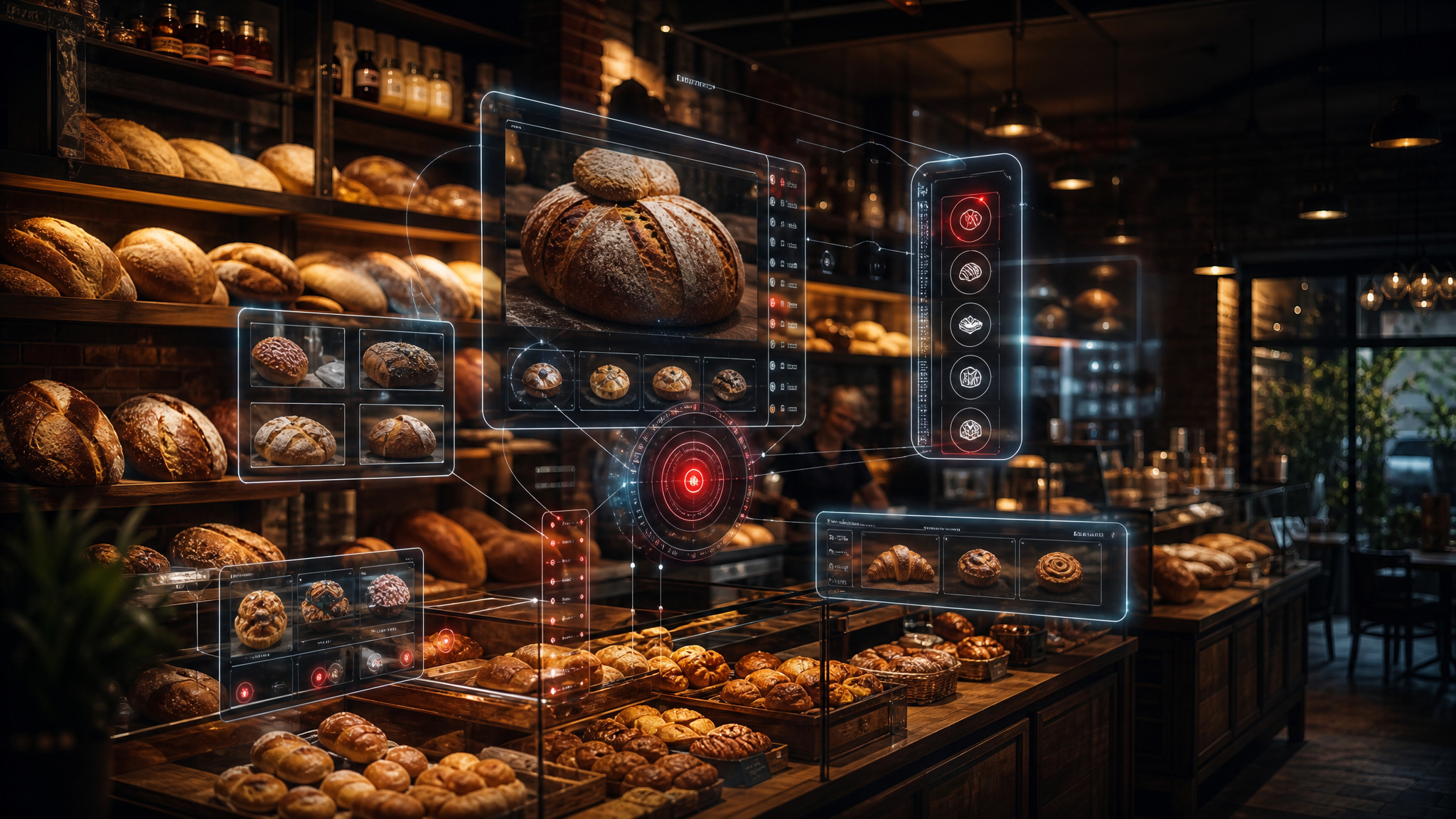
The neighborhood bakery has always been a cornerstone of community life, a place where the aroma of fresh bread mingles with the murmur of morning greetings and the chatter of neighbors catching up. It’s a sensory experience, a daily ritual, and a comforting presence. Yet, in our increasingly digital world, many beloved bakeries still rely on flat, one-dimensional websites that function more like static digital flyers than vibrant community hubs. For Rise & Crumb Bakery, a cherished local spot known for its crusty sourdough loaves, delicate flaky croissants, and comforting seasonal pies, the current website is a simple five-page affair: a static homepage with a rotating banner of pastries, a menu list that rarely changes, an “About Us” page with a brief paragraph of text, a location map, and a basic contact form. Visitors glance at it, perhaps note the address, and quickly move on. The site does almost nothing to capture the warmth, the inviting aroma, or the lively daily rhythm that makes people walk through the bakery’s real doors, leaving immense potential untapped.
Now, imagine an entirely different digital experience—one that doesn’t just tell people about the bakery but actively invites them in, lets them explore, and builds genuine anticipation before they ever step foot inside. This isn't about replacing the physical experience but enriching it, extending the bakery’s welcoming embrace into the digital realm. Here’s how an interactive website can transform a neighborhood bakery from a passive listing into a living, breathing digital extension of the storefront itself, making every visit, virtual or physical, a richer, more engaging experience.
The flat version
Rise & Crumb Bakery’s existing website embodies the limitations of a traditional online presence. It looks like countless others in the local business category: functional but utterly devoid of personality or dynamism. A generic hero image of a golden loaf sits above the words “Fresh Daily,” a promise that feels hollow without context or real-time proof. Below it, you’ll find a grid of product categories that are merely static photos—clicking a cinnamon roll image simply enlarges it, offering no further information, no sense of its warm, gooey center, or any opportunity for interaction. The menu is a cumbersome PDF that must be downloaded, creating an unnecessary barrier to quick browsing and frustrating users on mobile devices. Hours are listed in plain text that never updates automatically for holidays or special events, leading to potential customer disappointment. There is no way to see what came out of the oven thirty minutes ago, no sense of the friendly line forming at the counter, and certainly no opportunity to influence what gets baked tomorrow. The site is informative but utterly forgettable, failing to convey the simple excitement of pulling a still-warm loaf from a paper bag, the comforting crunch of a fresh croissant, or the reassurance of knowing your favorite morning pastry will be waiting for you. It’s a digital brochure that misses the very essence of a vibrant, sensory experience, leaving visitors feeling disconnected rather than drawn in.
Clicking through the reimagined site
Let’s follow Sarah, a working parent who lives just four blocks from Rise & Crumb. It’s 6:45 on a Tuesday morning, and while her coffee brews, she opens her phone. Instead of typing the bakery name into a search engine, she taps the bookmark for their new site, knowing that something interesting always happens there.
The page loads with a live, softly animated view of the bakery’s front window, bathed in the gentle glow of dawn. A wisp of steam gently rises from a digital illustration of the oven vents, hinting at fresh baking. Through the subtly frosted glass, Sarah can just make out the silhouette of a baker moving purposefully inside. A small, dynamic counter in the top right corner reads “Baked 11 minutes ago,” a real-time invitation drawn directly from the bakery’s point-of-sale system, instantly sparking a sense of anticipation. Sarah, feeling a familiar morning craving, taps the window. It opens like a real pane with a soft, satisfying click, revealing today’s just-finished items rotating slowly on a rustic wooden tray: a perfectly crusted loaf of rosemary garlic sourdough, its deep scoring visible; a tray of golden blueberry-lemon scones, studded with glistening fruit; and a single, glistening chocolate babka, its signature swirl of rich cocoa and dough clearly visible and inviting.
Curious about the babka, Sarah taps its image. The wooden tray slides gracefully aside, and a close-up card appears. Instead of a static photo, she sees a 15-second looping video of the babka being expertly sliced, the rich chocolate layers stretching enticingly as the knife glides through. Beneath the video are three clear, intuitive buttons: “Reserve a slice,” “Add to my usual order,” and “See what else pairs with it.” Intrigued by the possibilities and always looking for a perfect breakfast combination, she taps “See what else pairs with it.” The screen gracefully slides left to reveal a vibrant pairing wheel, reminiscent of a vintage fortune spinner. She spins the wheel with her finger, and it slowly lands on “Morning Coffee Pairing” with a gentle chime. The site instantly displays a beautifully rendered French press of the bakery’s rich, house Guatemalan blend, two generous slices of babka, and a small dish of creamy salted butter, all arranged on a charming wooden board. The total for this “Morning Ritual Bundle” appears—$9.75—along with a subtle note that three other people in the neighborhood ordered the exact same combination in the last hour, adding a touch of community connection and social proof without revealing any personal data.
Intrigued and ready to build her own breakfast, Sarah taps the “Build My Box” button at the bottom of the screen. A new, full-screen experience opens: an illustrated bakery case, complete with six empty compartments in a pristine white pastry box, ready to be filled. On the right is a scrolling ingredient rail containing every item currently available, from warm pastries like croissants and muffins to fresh loaves and even specialty coffee beans. She drags a pain au chocolat into the first compartment. The box registers the choice with a satisfying “thump” sound effect, and the illustration subtly shifts as the item settles, instantly updating the running total at the bottom of the screen. Next, she adds the rosemary garlic sourdough loaf, watching the box illustration adjust its weight and balance visually, ensuring a snug fit. When she tries to add a third croissant, a gentle animation shows the box lid beginning to lift slightly, accompanied by a friendly message: “Your box is getting full—ready to check out, or start a new one for tomorrow?”
Sarah chooses to check out. The site transitions smoothly to a streamlined ordering screen where she selects a pickup time from a live availability calendar that reflects real kitchen capacity, preventing any last-minute disappointments. She notices a small “Community Oven” section at the bottom, showing that the bakery is currently taking suggestions for tomorrow’s special bake. With a quick tap, she submits “lemon poppy seed muffins” and sees her idea instantly join a live tally of neighborhood requests, feeling a small thrill of participation. The entire process—from window tap to order confirmation—takes less than two minutes and leaves her feeling personally connected to the bakery’s daily rhythm and offerings.
Before closing the site, Sarah scrolls to the bottom of the confirmation page, where a short embedded video plays. It’s not a generic advertisement but a 30-second behind-the-scenes clip of the baker pulling her exact order from the oven, timestamped just minutes earlier. The warmth feels almost tangible, and she recognizes the baker from her visits. She smiles, sets her phone down, and begins getting the kids ready for school, already looking forward to swinging by on her way home, knowing exactly what awaits her.
The features that make it work
Several carefully chosen interactive elements turn Rise & Crumb’s new website from a passive brochure into an engaging digital companion, seamlessly integrating technology with the bakery’s artisanal charm. The animated front window serves as both an eye-catching visual hook and a functional dashboard, pulling real-time data from the bakery’s existing point-of-sale system to display items baked within the last hour. This live counter eliminates the common frustration of arriving only to discover a favorite item has sold out, building trust and enhancing the customer experience.
The pairing wheel demonstrates how thoughtful micro-interactions can spark creativity and significantly increase order value. By transforming an ordinary suggestion list into a playful spinning game, the site makes discovery feel fun and personalized rather than overtly sales-driven. Each landing result is dynamically generated from actual sales data and meticulously crafted flavor profiles developed by the bakery’s team, ensuring recommendations remain genuine, delicious, and seasonally appropriate.
The “Build My Box” interface transforms online ordering from a tedious checklist into a tactile and intuitive experience. Drag-and-drop functionality, combined with rich visual feedback such as realistic weight distribution, subtle item settling animations, and intelligent lid-lift warnings, mirrors the physical act of selecting items in the store. This innovative approach not only reduces order errors but also creates a strong emotional investment—customers who actively build their own boxes are significantly more likely to complete the purchase and return for future orders.
Live availability calendars and dynamic capacity indicators prevent the disappointment of unavailable pickup times, offering
Your website can be more than a one-dimensional advertisement. If reading this sparked an idea for your own business, come explore it with us. Open our Quote Chat and we’ll help you figure out exactly how an interactive website could work for you — no pressure, just possibilities.
What could this look like for your website?
Every idea here started with the same question: what if your site did more than sit there? Have a quick, AI-powered conversation with our project assistant and we’ll map out exactly how to turn your website into an interactive tool that works for your business.
Explore your ideas in the Quote Chat